01 — overview
Spotify Wrapped, for your whole aesthetic
My RoleSolo — research to tested prototype
Vibe is an AI-powered mobile app concept that consolidates a person's fragmented digital taste data — camera roll, Spotify listening history, saved posts — into a single, shareable visual identity board. Think Spotify Wrapped, but for your entire aesthetic.
This was a solo project for Cognitive Science 112: Uncovering the Cognitive Science Behind the User Experience at UC Berkeley. Every phase — from interview planning to prototype testing — was completed in 4 weeks.
2
Structured 1:1 interviews that disproved the original hypothesis
5
UI screens designed and usability tested end-to-end
3×
User needs statement revised — each time grounded in new research
UX Research
Empathy Mapping
Journey Mapping
Interview Design
Usability Testing
Figma Make
AI Product Design
Norman's Design Principles
02 — problem
Text can't carry a vibe
Target user: Trend-conscious Gen Z digital natives (18–26) who actively curate visual taste across Pinterest, Instagram, TikTok, Spotify, and their camera roll — but struggle when asked to describe their own aesthetic in words.
Pain Point 01
Taste data is fragmented across 5+ places
Screenshots, Notes app, Instagram saved collections, TikTok likes, Spotify playlists — never consolidated anywhere, impossible to see the whole picture at once.
Pain Point 02
Language fails to carry a vibe
One interviewee used the Korean word "청순하다" — the closest English equivalent is "innocent and pure," but that translation loses exactly what makes the word work.
"Without visuals, it's hard to explain my style."
So the goal wasn't to tell people who they are. It was to give them a better way to show it.
How might we turn a Gen Z user's scattered saves into one visual, shareable answer to "what's your vibe?"
03 — solution
Your camera roll, turned into a vibe board
Connect your camera roll and Spotify, let the AI read them, and get one board with your aesthetic label, color palette and soundtrack. It's built to be shared, not just viewed.
The flow · answers Insights 01–03
One scan, one board
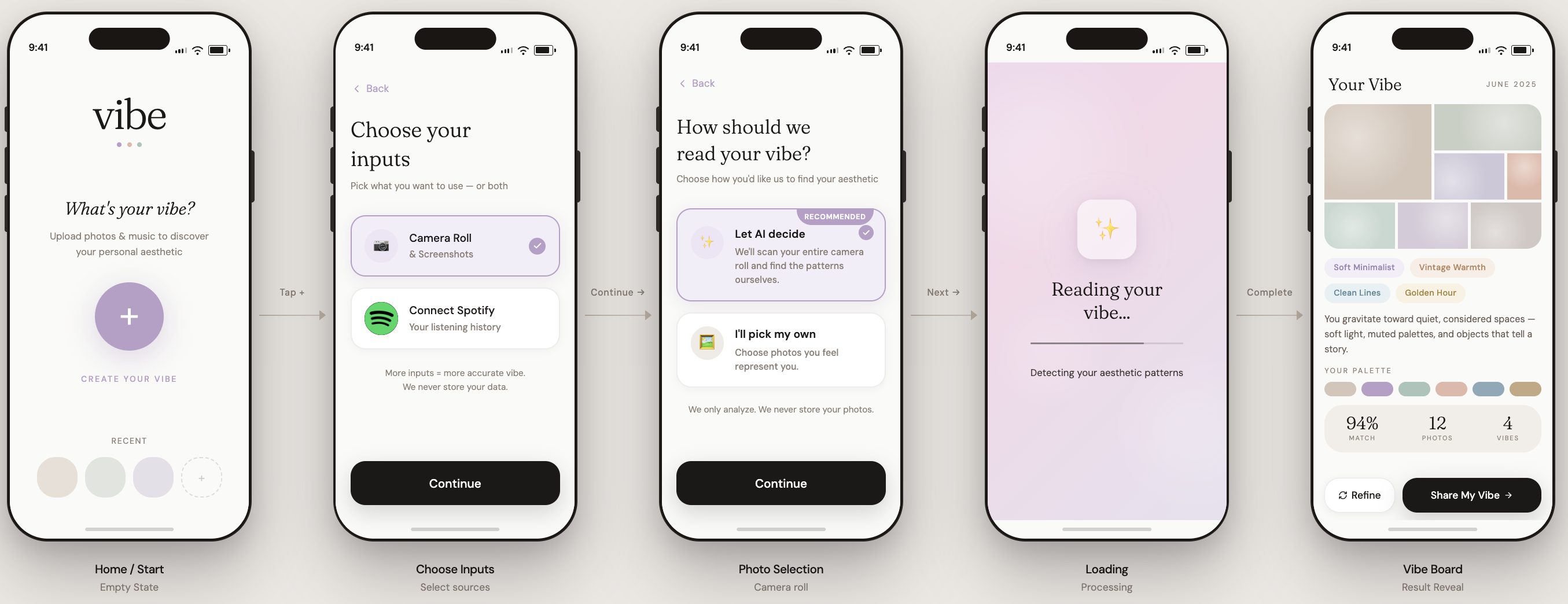
Five screens take you from "What's your vibe?" to a board worth posting.
Design decision
Why recommend the AI scan over picking your own photos? People pick what they think represents them, not what actually does. The camera roll shows real life, not a curated version. Trade-off: a full scan feels invasive to some users, so manual selection stays one tap away and the app says up front that photos are never stored.
How each screen answers the research:
01
Home / Start
Empty state. Headline: "What's your vibe?" One circular "+" button — Create your vibe. A row of recent boards below.
Norman's discoverability — one question, one clear action, no unnecessary decisions at the entry point.
02
Choose Your Inputs
Two tappable cards: Camera Roll & Screenshots, Connect Spotify. Sources are combinable. "More inputs = more accurate vibe. We never store your data."
Clear affordances — designed because research showed taste data is never in one place.
03 · key screen
Permission & Scan Mode
"How should we read your vibe?" Two choices: Let AI decide (recommended) — full camera roll scan; or I'll pick my own — manual selection. Reassurance: "We only analyze. We never store your photos."
The key design decision: AI scan is recommended because manual self-selection introduces bias — people consciously pick what they think represents them, not what actually does. The camera roll captures real lifestyle, not a curated version.
04
Loading State
"Reading your vibe... Mapping your visual mood." Animation with progress micro-copy.
Norman's feedback principle — transparency about what the system is doing builds trust and manages wait anxiety. Ambiguity is the stressor, not the wait time itself.
05
Vibe Board Reveal
Aesthetic label ("Soft Minimalist + Vintage Warmth"), color palette, stat row (94% match, 12 photos, 4 songs), Refine / Share My Vibe buttons.
Designed as a "moment," not a results page — worth keeping and sharing. Natural mapping: palette from photos, keywords from playlists.
04 — research
Two people, scattered across five apps
Structured 1:1 interviews following a formal interview plan (target audience, recruitment approach, 5 core hypotheses, warm-up script) per the CogSci 112 UX research framework.
Interviewee #1
23, female, UC Berkeley alumna, works at Amazon
Describes aesthetic as "Kimjiwon / chic, girlish." Saves via screenshots, Instagram, notes app. Taste driven by algorithmic feedback and celebrity references. Said: "Without visuals, it's hard."
Interviewee #2
23, female, college student, digital native
Describes aesthetic as "clean girl, classy vibe." Uses TikTok and IG saves. Frustrated by language barriers: "청순하다" → "innocent" loses the meaning. Thinks contextually about style (TPO: Time, Place, Occasion).
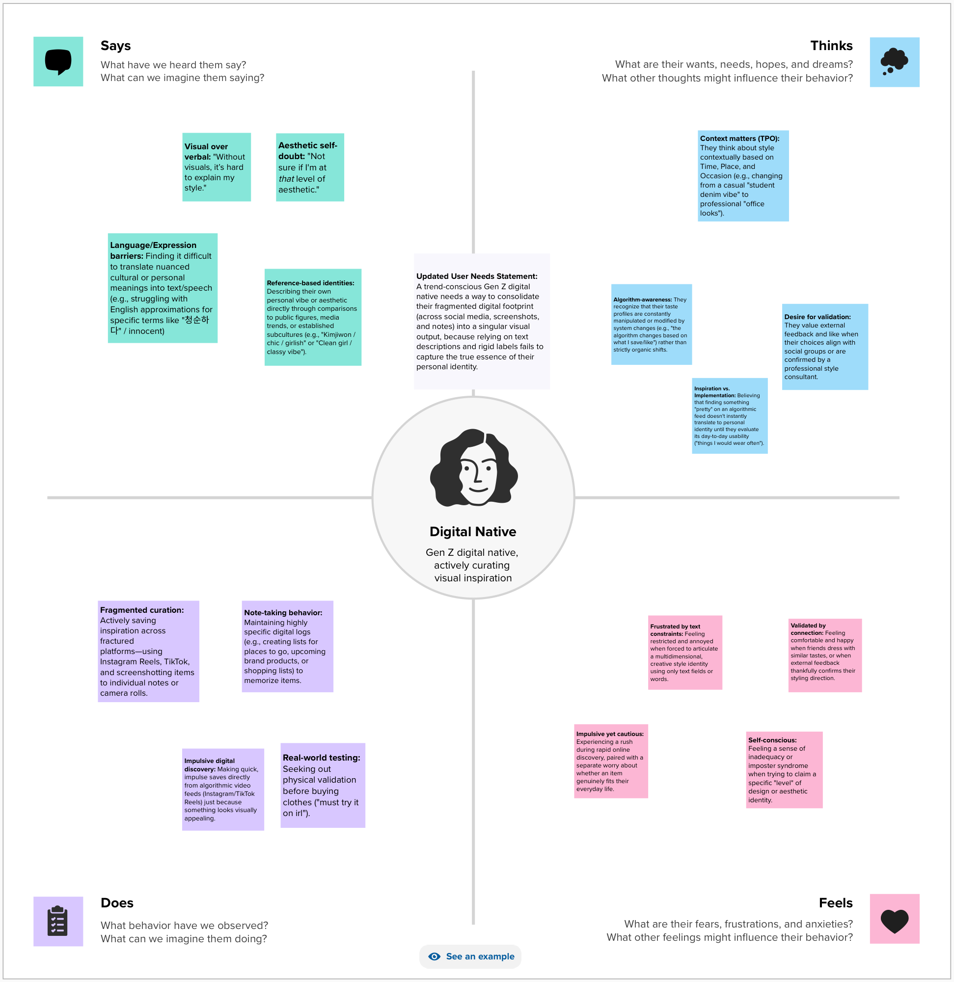
Empathy map — Says / Thinks / Does / Feels across the Gen Z aesthetic curator persona
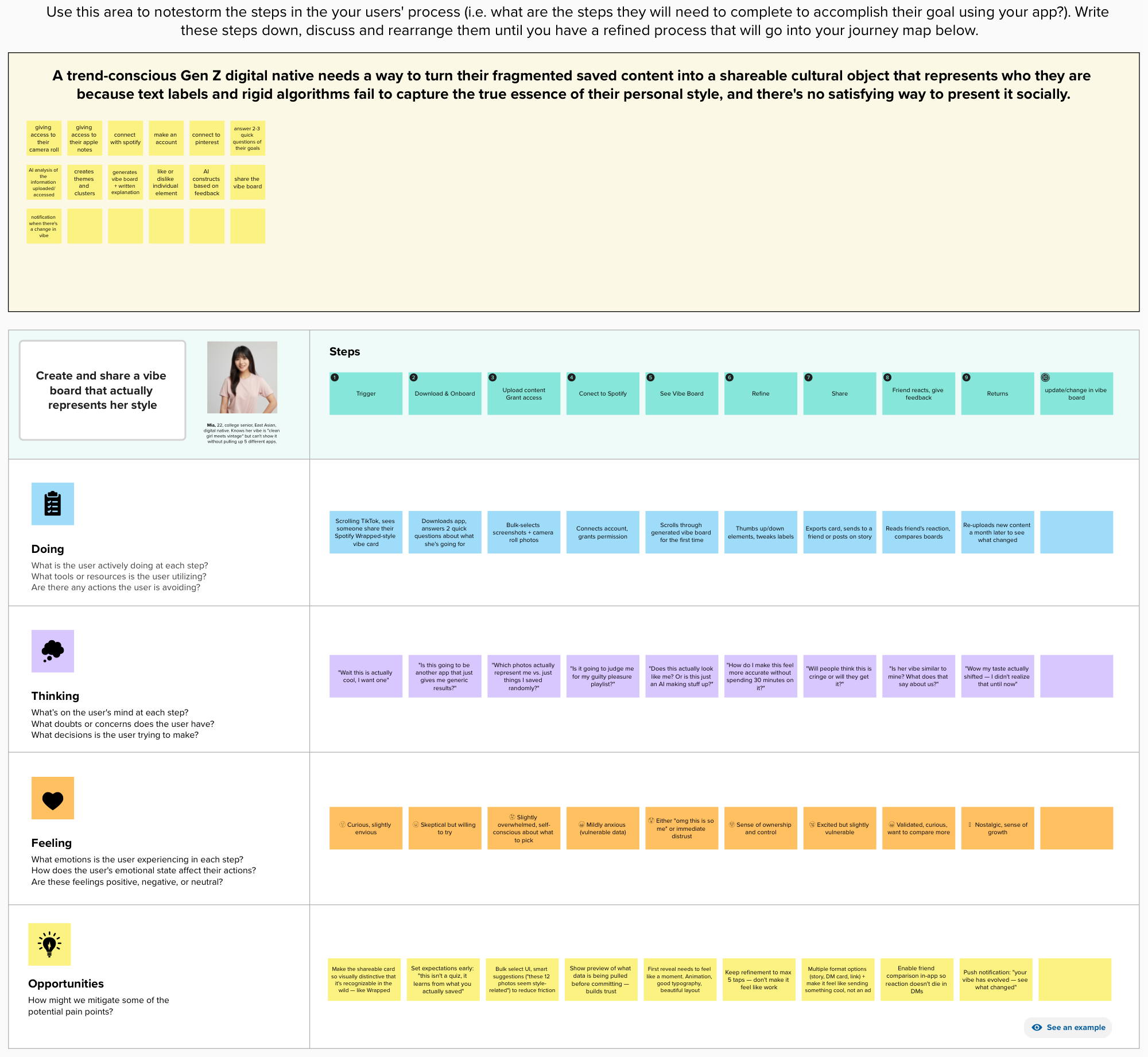
Journey map — Doing / Thinking / Feeling / Opportunities across each stage
05 — insights
What did I find?
Insight 01 — Fragmented
Their taste lives in five apps
Both interviewees kept their taste in scattered places: screenshots, the Notes app, Instagram saves, TikTok likes. It's never in one spot, so they can never see the whole picture.
→ Led to: Choose Your Inputs
Insight 02 — Expression
Words lose the vibe
"Without visuals, it's hard to explain my style."
Describing an aesthetic in words falls flat. One interviewee's Korean word 청순하다 becomes 'innocent and pure' in English, which loses exactly what makes it work.
→ Led to: Vibe Board Reveal
Insight 03 — Evolution
The algorithm shapes the taste
"The algorithm changes based on what I save/like."
Style shifts through celebrities, friends and curiosity, but also through what platforms choose to show. Taste is never fixed, so a one-time label won't hold.
→ Led to: Refine
06 — the pivot
Two interviews killed my first idea
The project didn't start as Vibe. It started as Identity OS, built on an assumption the interviews proved wrong.
Before — Identity OS
Help users discover their identity
Original hypothesis: users are confused about who they are. They need a tool to synthesize their scattered data and surface patterns they don't already see about themselves.
→
After — Vibe
Help users express who they already know they are
What interviews revealed: both interviewees immediately named their aesthetic ("clean girl," "chic, girlish"). They weren't confused about their identity — they just couldn't express it. The problem was expression, not discovery.
Two interviews were enough to rename the product, rewrite the user needs statement, and redirect the entire feature set.
The user needs statement evolved three times as research sharpened the problem:
v1 — initial
A self-curating Gen Z digital curator needs to synthesize and identify underlying patterns across their scattered digital data to deeply understand and articulate their personal aesthetic identity to others.
v2 — post interviews
A trend-conscious Gen Z digital native needs a way to consolidate their fragmented digital footprint into a singular visual output, because relying on text descriptions and rigid labels fails to capture the true essence of their personal identity.
v3 — final
A trend-conscious Gen Z digital native needs a way to turn their fragmented saved content into a shareable cultural object that represents who they are — because text labels and rigid algorithms fail to capture the true essence of their personal style, and there's no satisfying way to present it socially.
07 — testing
The wait was fine. The spinner wasn't.
Moderated usability tests with 2 participants — each given realistic task scenarios (e.g. "You want to use the app but your camera roll has personal photos in it — what do you do?"). Think-aloud protocol throughout.
Finding 01 — Validated
The privacy divide matched the hypothesis exactly
User 1 chose manual upload: "It feels invasive. I have too many personal photos that don't reflect my aesthetic." User 2 chose AI full scan without hesitation: "I trust AI. If I'm concerned about privacy, I wouldn't use AI at all."
Finding 02 — Validated
The reveal worked — both users responded emotionally
User 1 smiled and said "I like how it grouped songs to certain aesthetics. I want to save it and show it to people." User 2 liked the design elements and immediately thought about sharing ("link in bio").
Finding 03 — Assumption debunked
Loading patience was about feedback, not time
Predicted: users lose patience after 5 seconds. Reality: User 2 was willing to wait because she understood she'd uploaded "tons of information." A generic spinner caused confusion ("Is it frozen?") — step-by-step copy like "Scanning Spotify playlists…" resolves it.
Finding 04 — New signal
Swap/edit feature was immediately requested
User 2: "I want to swap a few things if the AI pulled out information that doesn't really represent me." This points to a missing feature: per-element replacement without redoing the whole scan.
"Knowing the app is actively analyzing my data makes the wait feel intentional instead of broken."
— Pattern from both user tests · confirmed Norman's feedback principle
08 — reflection
Expression, not discovery
The original assumption was wrong. Users don't need help discovering who they are — they need better ways to express who they already are. Two interviews were enough to rename the product and redirect the entire feature set.
The pivot from Identity OS → Vibe is the most direct demonstration of what research is actually for: not confirming what you already think, but finding the version of the problem that's actually true.
Three concrete next steps if this were to continue:
- Let users replace individual elements the AI got wrong — restoring control without redoing the whole scan
- Add a preview of exactly what the AI will analyze before the scan begins, for privacy-conscious users
- Expand inputs beyond photos and Spotify to Pinterest and Notes app, for a richer aesthetic read
09 — phase 2 vision
What if every app knew your vibe? (not yet user-validated)
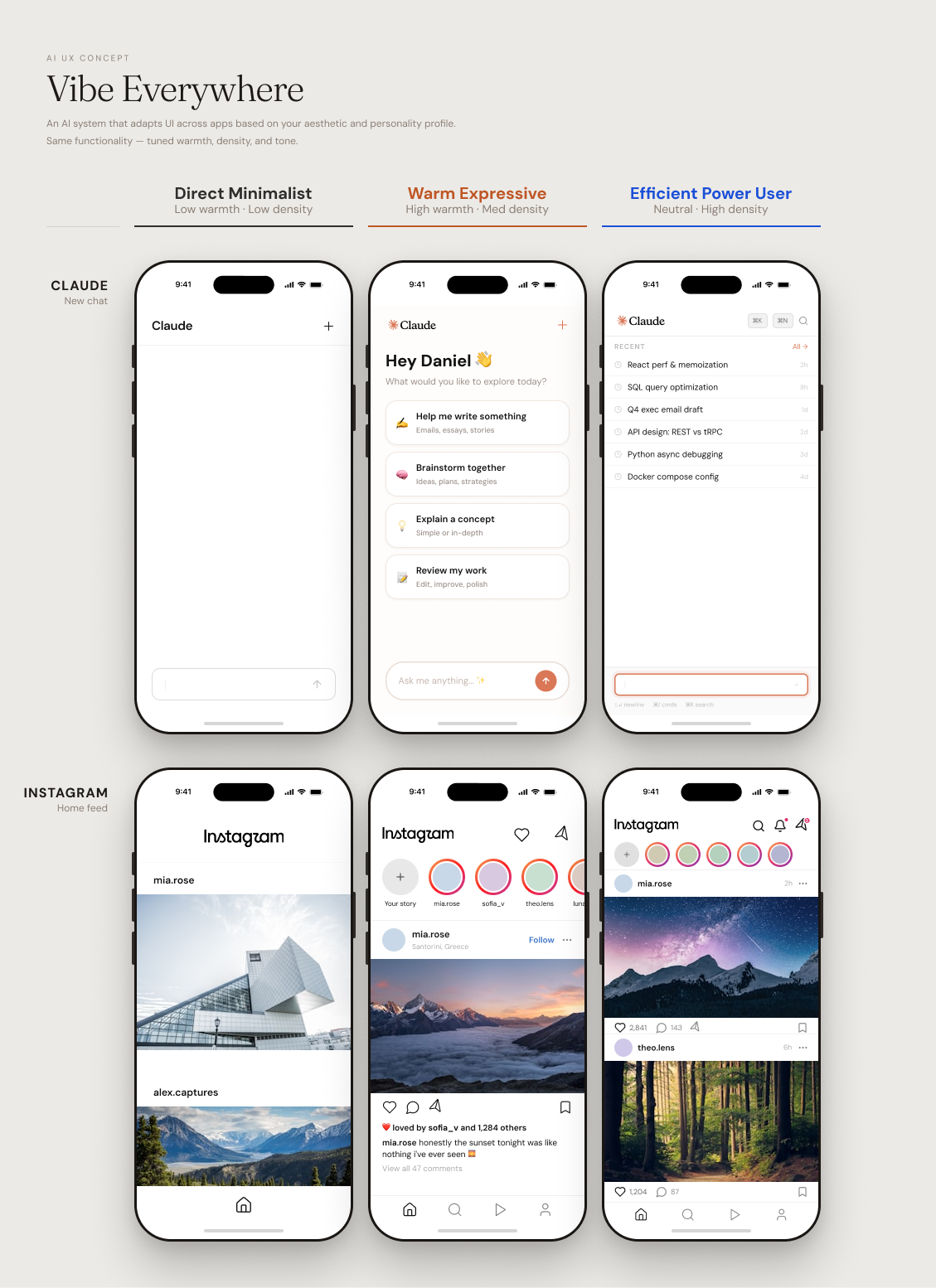
Vibe already tells a user who they are. The next question: what if that same profile became a layer that other software adapts to — not just Vibe's own interface, but apps like Claude or Instagram, adjusted per person?
This connects to a real research lineage in HCI: adaptive interfaces — historically built for accessibility (motor-ability differences). Vibe Everywhere applies the same underlying logic to a different axis: aesthetic and personality fit. Cognitive science grounding: person-environment fit — satisfaction improves when an environment matches a person's traits.
The project has two distinct layers. The Profiler AI, what this project has covered so far, handles reading a person's taste data and translating it into interface-relevant axes. The Stylist AI, which is this Phase 2 vision, handles taking those axes and deciding what the interface actually does with them.
Three personas used to prototype the concept:
"Vibe already tells users who they are. Vibe Everywhere asks: what if the software they use every day could adapt to that answer — not by generating a new interface from scratch, but by selecting the right expression of it for each person?"