What is Campus Connect?
Campus Connect is a startup building an all-in-one platform for college students — combining a peer marketplace, anonymous community forum, ride sharing, housing search, and a smart home dashboard into a single app tailored to campus life.
I joined as Product & UX Research Lead, responsible for owning the research pipeline, designing and testing UI concepts in Figma, and building early data infrastructure to validate the product before full development.
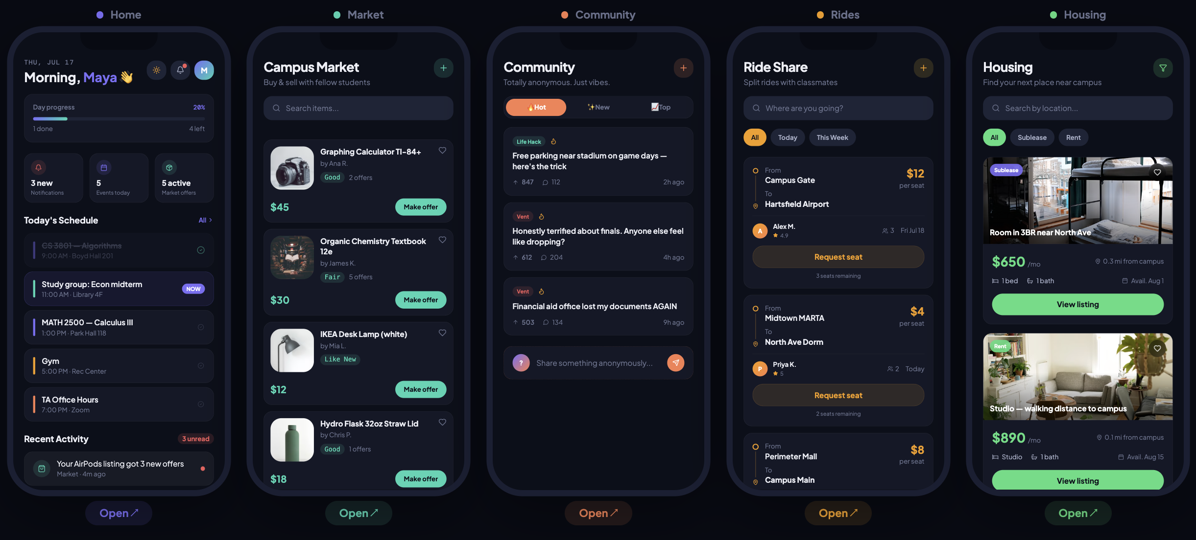
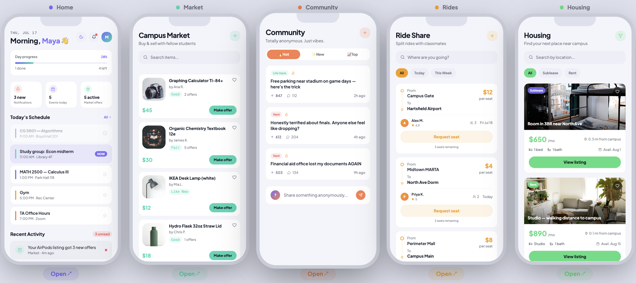
Five features, one campus platform
Campus Connect spans five core features, each solving a distinct pain point for college students. The challenge was designing a cohesive experience that doesn't feel fragmented — while making each feature feel purpose-built for its context.
Finding the friction — 100+ usability tests
I led the full research pipeline — designing test scenarios, running moderated usability sessions, and synthesizing findings into actionable friction points. With 100+ sessions across the product's core flows, I identified 3 key friction areas that were blocking user progress.
15+ Figma mockups to test & refine
I developed 15+ interactive UI mockups in Figma to test feature concepts and refine interaction logic before handing off to development. Each mockup was tied directly to a friction point or research hypothesis — not just visual exploration.
Goal: improve task completion clarity by 35% during moderated sessions — by making the right action obvious at every decision point, removing ambiguity, and surfacing status at a glance.
5,800+ course records — building the data layer
To accelerate early product validation, I used Python + BeautifulSoup to scrape and structure 5,800+ course records, building a searchable "Rate My Professor" style data prototype for the platform.
This wasn't just a technical exercise — it was a product decision. Having real, structured course data meant we could prototype the scheduling and discovery features with actual Berkeley courses instead of dummy content, making usability tests far more realistic and our findings more reliable.
- Scraped 5,800+ course records including instructor, ratings, schedule, and enrollment data
- Structured the data for searchability — normalized fields, removed duplicates, formatted for frontend consumption
- Built a prototype data layer that fed directly into the Home dashboard scheduling feature
- Enabled more realistic usability testing by replacing placeholder content with real Berkeley courses
# ── Imports ────────────────────────────────────────────
import re
from urllib.request import Request, urlopen
from bs4 import BeautifulSoup, Tag
import pandas as pd

BASE_URL = "https://classes.berkeley.edu"

# ── Fetch raw HTML with spoofed User-Agent ──────────────
def fetch_html(url: str) -> bytes:
    req = Request(url, headers={"User-Agent": "Mozilla/5.0"})
    with urlopen(req) as resp:
        return resp.read()

# ── Parse one course card → structured dict ─────────────
def parse_card(card: Tag) -> dict:
    course_name = card.select_one(".st--title h2")
    professor   = card.select_one(".st--instructors")
    days        = card.select_one(".st--meeting-days span:last-of-type")
    time_el     = card.select_one(".st--meeting-time span:last-of-type")

    start_time = end_time = None
    if time_el:
        parts = [p.strip() for p in time_el.get_text().split("–")]
        if len(parts) == 2:
            start_time, end_time = parts

    return {
        "Course Name" : course_name.get_text(strip=True) if course_name else None,
        "Professor"   : professor.get_text(strip=True)   if professor   else None,
        "Days"        : days.get_text(strip=True)        if days        else None,
        "Start Time"  : start_time,
        "End Time"    : end_time,
    }

# ── Paginate across 334 pages of Berkeley class listings ─
def crawl_with_pagination(url_template: str, max_pages: int = 334):
    all_rows = []
    for page in range(0, max_pages + 1):
        rows = parse_single_page(url_template.format(page=page))
        if not rows: break
        all_rows.extend(rows)
    return all_rows

# ── Run scraper → export 5,800+ rows to Excel ───────────
if __name__ == "__main__":
    URL = ("https://classes.berkeley.edu/search/class?"
           "f%5B0%5D=term%3A8576&page={page}")
    rows = crawl_with_pagination(URL)
    df   = pd.DataFrame(rows)
    df.to_excel("berkeley_schedule_all.xlsx", index=False)
    print(f"[DONE] {len(df)} rows saved")  # → 5,800+ records
What moved the needle
The combination of qualitative usability research, rapid Figma prototyping, and real data infrastructure gave the team a validated foundation to build from — compressing the typical research-to-build timeline significantly.
What I learned leading 0→1 product research
Working on a startup from zero taught me that research at the 0→1 stage looks completely different from research at scale. There's no existing user base to survey, no historical data to reference, and no time for a 6-week discovery sprint. You have to move fast, make smart bets on what to test, and extract signal from every session.
The data scraping work also reinforced something important: the best prototypes use real data. Seeing "CS 3801 — Algorithms, 9:00 AM, Boyd Hall 201" in a usability test produces completely different (and more reliable) feedback than seeing "Course Name, Time, Location."
Key takeaway: In a startup, the PM and researcher roles blur constantly. The ability to move between strategy, research, design, and code in the same week — and know when to switch — is the actual skill.